I built Spell Star for my own class, so for a long time it worked exactly the way I worked. Then other teachers started using it, and they were kind enough to tell me where it was getting in their way.
Some of it I already suspected. Some of it I was too close to see. Either way, I spent the last few weeks reworking the parts that kept coming up, and the app is noticeably simpler to use now. Here's what changed and why.
Getting Students Logged In Was the Biggest Headache
This was the number one thing I heard, and honestly the number one thing I felt myself.
The old flow leaned on student accounts and Google logins, which is fine for older kids who know their details off by heart. For younger students it was a nightmare. Forgotten passwords, mistyped emails, the whole class stuck at the login screen while you troubleshoot one kid's account instead of actually starting the lesson.
So I scrapped it and built a proper student join flow. Now students go to spell.tebtally.com/join, type in a class code, tap their name from a list, and enter a 4-digit PIN. That's it. No email, no Google account, no password resets.
You can also print login cards for the whole class, one per student, with their join code and PIN already on them. Hand them out once, stick them in the front of a book, and logging in stops being a thing you have to think about. For a Year 3 class especially, this alone has been worth the rework.
Making a List Took Too Many Steps
The other big one: creating and assigning a list involved too much clicking.
You'd make the list in one place, then go somewhere else to assign it, then set a schedule, then pick who gets it. Every step made sense on its own, but stacked together it turned a two-minute job into a small chore, and small chores are exactly the kind of thing that make you put off setting spelling for another day.
Now it's one screen. Paste your words in, set a due date, done. If you need the fiddly stuff, scheduling a release for later, targeting specific students, differentiating groups, it's tucked behind an "Advanced" option so it's there when you want it and out of your way when you don't.
The default path is now the fast path, which is how it should have been from the start.
Nobody Wants to Retype Last Term's Lists
A few teachers pointed out that they were rebuilding similar lists over and over, which is exactly the kind of repetitive typing I built the app to avoid in the first place.
So when you create a list now, there's a "Reuse a previous list" picker that pulls up anything you've made before. I also folded word banks into the same place, so if you keep a running set of words for a unit or a spelling program, you can pull from it without starting from scratch. Less retyping, less Sunday-afternoon admin.
The Results Page Was Doing Too Much
The old results view tried to show everything at once, and the result was that it showed nothing clearly.
I collapsed it down. You now see your classes as simple chips, and each list gets a clean summary card. You can still dig into individual student results when you need to, but the default view answers the question you actually have most of the time, which is "how did the class go on this one," without making you hunt for it.
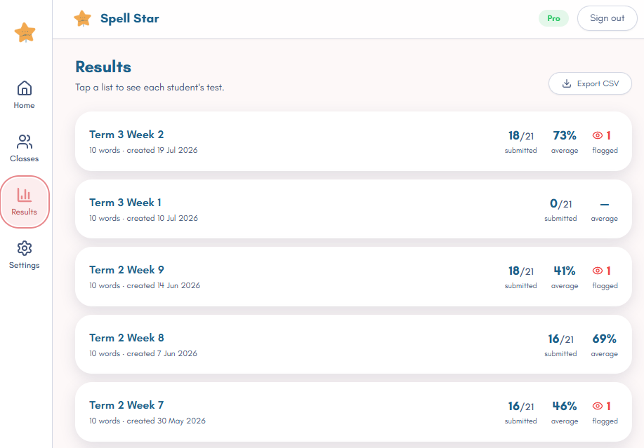
While I was at it, I trimmed the navigation down to four things: Home, Classes, Results, and Settings. On a phone that's a bottom tab bar, on a desktop it's a side rail. Fewer places to get lost.
A Fresh Coat of Paint
The whole app got a visual rework too. New design system, cleaner cards and buttons, proper dark mode, and it finally feels consistent with my other apps instead of looking like a slightly different era of the same project.
Spell Star also has a mascot now, a little star guy, who shows up around the app. Not essential, I know, but the kids like him and he makes the student side feel less like a form to fill in.
What I Deliberately Didn't Touch
Here's the part I want to be honest about, because "we reworked the app" can sometimes mean "we broke the thing you relied on."
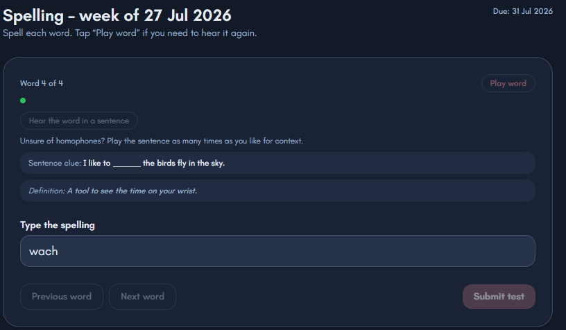
The engine underneath is exactly the same. The test runner, the automatic definitions and example sentences, the read-aloud voices, the results tracking, none of that changed. This was a rework of the parts you tap and look at, not the parts that do the actual work. If Spell Star was already doing the job for your class, it still does, just with a lot less friction getting there.
I'm biased, obviously, since I built the thing. But this is the version I wish I'd had when I started, and it came almost entirely from teachers telling me what was annoying them. So if you're using it and something's still getting in your way, tell me. That's genuinely how this stuff gets better.
If you want the background on why Spell Star exists at all, I wrote about the problem with traditional spelling tests and why I built something different.
Share your thoughts on this post
No comments yet. Be the first to share your thoughts!